Applying a UX & Technical Writing Lens to Mail-in Voting
Table of Contents
Notes
Full disclosure, this post is adapted the from the Wordpress site’s October 2020 post. I’ve made changes to the writing here and there and any links or screenshots may differ as well as they’re from the context of that time period.
Introduction
With the topic of mail-in and absentee voting in national headlines, shift J decided to take a look at the process through a UX/technical writing lens. Our mission is evaluating the user experience of obtaining a mail-in or absentee ballot and offering our observations on improving the process.
Caveats up front—this was not a scientific process. See the points below for our guiding criteria.
- We paid attention to things like “number of clicks from X to Y” and controlled for browser (Chrome) and search terms.
- We didn’t use test subjects or controlled environments, nor did we test on a wide variety of platforms—we used one PC and one Mac. Is the experience better on mobile or tablet? We don’t know. Are these procedures accessible? We didn’t measure that either.
- We tried to approach the problem objectively and had no intention for this to be a partisan look at the question of mail-in ballots.
- By the time this article is published it is likely that the main search results will appear differently than they did during the writing process. It is also likely, if not certain, that different users would get different results even if the searches were simultaneous.
Background
The goal of any UX, technical writer, or designer is to communicate clearly and help the user complete a task. If we assume that the task for voters is casting a vote, the current success rate in the United States, about 60% of eligible voters voted in the 2016 presidential election, is unacceptable.
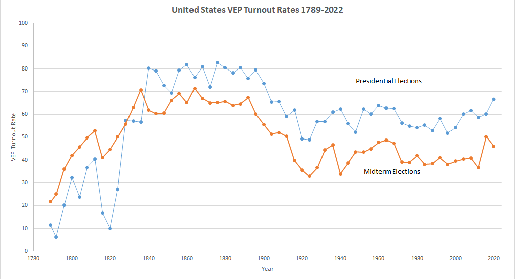 Courtesy of US Elections Project.
The 2020 election created new obstacles for user success and seems likely to be the first election in history to see a major shift in how voters cast their ballots. In a way, the move from in-person to mail-in voting is akin to changing the interface on a computer or mobile device, and raises the possibility of user confusion and error. Could the application of UX and technical writing methods help improve the process and boost success rates?
Scope was our first problem to solve. We felt it would be overly ambitious to review procedures for all 50 states, so instead, we focused on three states—California, Georgia, and Florida.
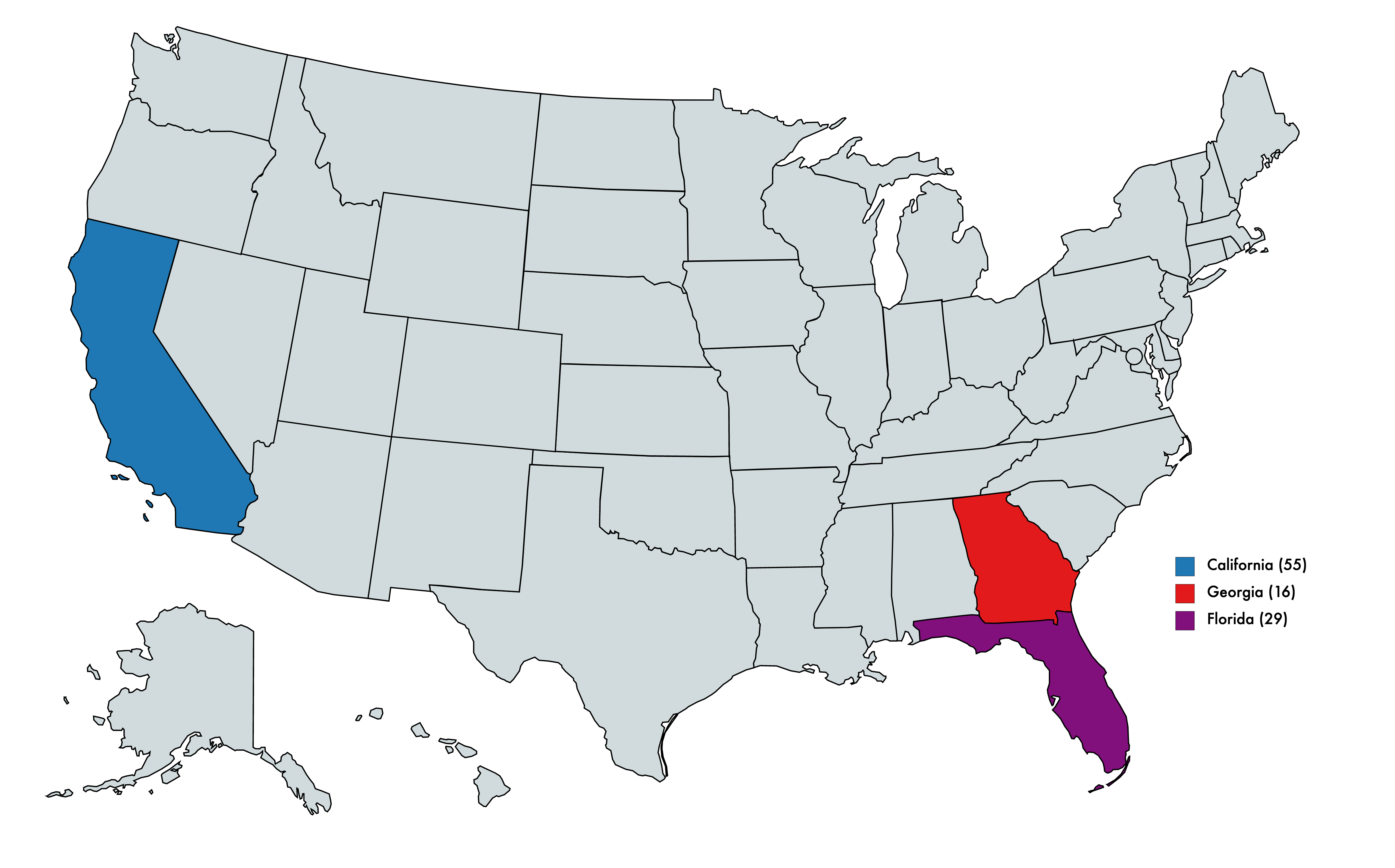
Why those three?
- Together they represent a slice of the current political spectrum. California has voted Democratic in every national election since 2000. In the same period, Georgia has voted Republican. As for Florida, it has swung back and forth between the parties.
- They are each electorally significant, i.e. each represents the largest number of electoral college votes within their category; California has the most votes of consistently “blue” states (55), Georgia among the “red” (16), and Florida among the “purple” or “swing” states (29).
- Each offers any voter the option of voting by mail.
NOTE: While Texas,the largest “red” state by electoral college votes, does offer absentee ballots to those with a demonstrated need, the state does not offer absentee ballots universally. It was excluded from our survey.
Once we defined our scope, we moved forward with how we would conduct our examination.
- Google Chrome browser set at 100% magnification
- Search terms of “mail-in ballot [state]”
- Examining search results, i.e. a subjective look at how easy is it for a user to find what they need to complete the task once the search is complete
- Find top “official” link to more information, official being the state or government resource responsible for organizing or distributing mail-in ballots, a
.govaddress, and assess whether that page presents information in a clear, easy to use manner
From there we would follow up on these criteria.
- Assess how easy it is to find information about obtaining a mail-in ballot on the official page.
- Examine the process, if any, required to obtain a mail-in ballot.
- Establish whether information is given about how to track the status of your ballot.
Finally, we planned to offer some general overall “post-mortem” type observations.
California
We’re going with alphabetical order here.

Search results
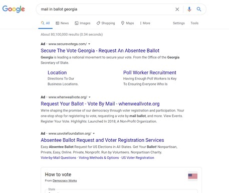
Below is the page that resulted from a search for “mail-in ballot California” with a standard Chrome browser.
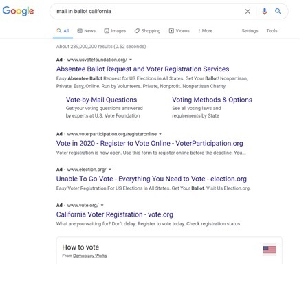
The first thing we noticed was that there was no “official” state link above the fold when viewed at 100%.
The second thing we noticed was the proliferation of sponsored links. While it is possible that each of these links leads to a high quality and trustworthy site, none of them are the “official” web site. Asking the user to determine which link is good is a distraction from the core task.
Once users scroll past the ads. and an inline widget created by “Democracy Works” as well, they arrive at the first official link.
Official page
The official link led to the page below.
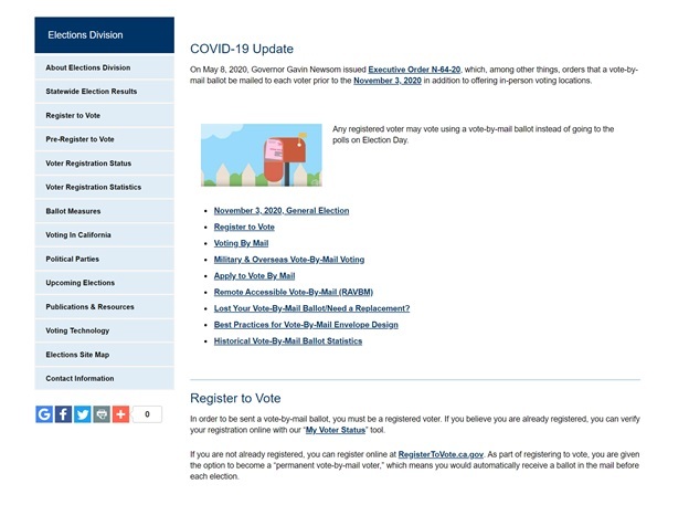
It offers us an opportunity to compile a list of pros and cons.
| Pros 👍 | Cons 👎 |
|---|---|
| The information highest on the page notes that each voter in California will be automatically provided with a vote-by-mail ballot. | This text could be larger, distinguished by color or border or more ideally both. This is important information that any California resident looking for vote-by-mail information should know. |
| The page uses a color-coded sidebar navigation that is clearly separated from the main pane. | The term “each voter” does not make clear whether “voter” means “person eligible to vote” or “person registered to vote.” |
| The main panel makes use of an unordered list of links to available topics, including “Register to Vote”, “Voting by Mail” and “Apply to Vote by Mail.” | The sidebar does not contain links to information about voting-by-mail. |
| The page is rich in links. | The inclusion of a link to the topic “Apply to Vote by Mail” implies that a voter must take some special action. |
| Other than the division between the sidebar and ordered list in the main panel, the links are not organized in an obvious pattern or hierarchy. | |
| The links in the main pane are all anchor links. This type of link is functional but can be disorienting. |
Finding information about mail-in ballots
It could be argued that a user looking for mail-in ballot information in California has completed their task—it says clearly, if not too obviously, on the main page that all voters will automatically get a ballot.
However, the page is also unclear about who a “voter” is. Does this mean registered, eligible? The inclusion of a link the topic “Apply to Vote by Mail” implies that there might be additional steps involved.
The answer to the first question is under the heading “Register to Vote,” where it is clear that in order to receive a vote-by-mail ballot one must already be registered. Links are provided to help browsers confirm that they are registered, or if they are not, to become so.
There are partial answers to questions about additional steps for voting under the heading “Register to Vote,” but the “Apply to Vote by Mail” topic is still confusing. Users who click on it learn that, if they are already registered, no further steps are required.
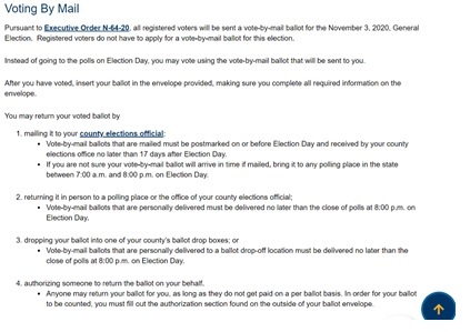
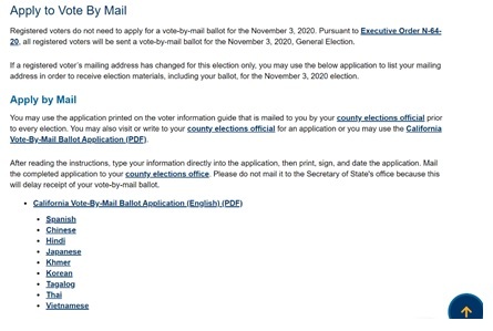
Finally, the site does provide information on how to vote by mail.
Ballot tracking
A user who follows the “Voting by Mail” topic at the top of the main page will find a section like this.
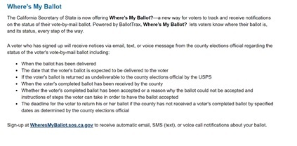
The link at the bottom, wheresmyballot.sos.ca.gov, actually leads you to https://california.ballottrax.net/voter/, which could be confusing. BallotTrax is a privately-owned service operated by Colorado-based software company i3Logix. A number of jurisdictions are working with this service in in 2020. The California-specific landing page looks like the screenshot below.
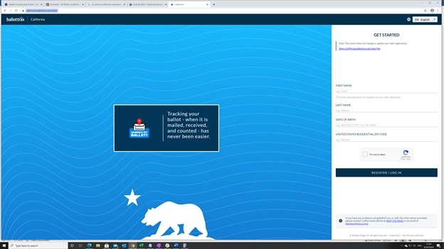
From here, you need to appear on the California voter rolls to proceed. We presume the experience is a good one, but we do not know.
California summary
California has some work to do. The most important information on the official page is that all registered voters will automatically get a vote-by-mail ballot. Full stop, no further effort required.
The second and third things below should be front and center as well.
- Check if you are registered
- Register if you are not registered
- This information and these topics should be visually distinguished from the rest of the page to ensure that visitors to focus on the information as they arrive at the page.
Less important changes, though still valuable, would include some of these suggestions.
- Removing irrelevant topics—such as “Apply to Vote by Mail.”
- Resolve any conflicts or overlaps between the left-hand navigation bar and the linked topics in the main frame.
- Stop using anchor links.
- Finally, we have thoughts about BallotTrax—it is confusing to click on a link having a
.govdomain name, only to land on a site run by a private company in a different state.
Florida
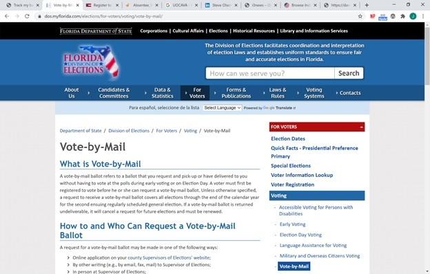
When it comes to voting by mail, Florida’s approach is pretty good.
Search results
Florida has the same problem as California, and spoiler-alert Georgia as well, when it comes to finding the main state government voting page. Interestingly, there were fewer and different ads when searching for Florida than when searching for California or Georgia.
The now-familiar “Democracy Works” inline widget is again present, populated this time with Florida-specific information.

Official page
Florida’s landing page gets right down to business with large fonts, separators, and a nice navigation tree that shows exactly where you are in the informational architecture of the Florida government website.
| Pros 👍 | Cons 👎 |
|---|---|
| For users looking for “mail in ballot Florida”, this page offers relevant answers that are easy to find. It also takes the nice step of defining the term, and also notes the limitations around mail-in voting in Florida. | Florida’s system has to be renewed annually. Unless they read carefully voters might think they’ve registered permanently (or forget how it works) and then miss out on a future election. |
| The site uses an unordered list of ways in which voters can apply to vote by mail. | |
| The site offers a color-coded right hand navigation bar richly linked with relevant topics. |
Finding information about mail-in ballots
From the main page, the simplest step for a Florida voter is to click on the link to “your county Supervisors of Elections’ website.” When you do, you must then choose your county and arrived at the following page.
NOTE: We chose Lake County because Jeremiah has family there.
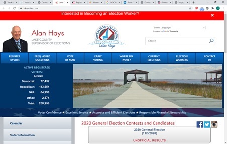
The information sought is pretty easy to find, although it could be easier. To be fair, this site doesn’t know why we have arrived, only that we clicked on Lake County. The relevant link is in the main horizontal navigation bar and leads to this.

Again, terms are defined, which is helpful, and this page does us the favor of using bold text to remind us that registering to vote by mail has an expiration. The page also uses color in addition to larger fonts to highlight major sections of interest. One obvious fault is the use of an ordered list under “Requesting a Ballot.” This implies that each step must be completed sequentially, which is not the case.
A user who clicks on “Mail Ballot Request Form” is taken to a page that checks if you are a registered voter in Lake County. We are not, so our journey ended here.
Ballot tracking
The process in Florida is similar to applying for a mail in ballot. You visit your county elections page, go to Vote by Mail, and then scroll down to a section titled “Tracking a Vote-by-Mail Ballot Request & Returned Ballot.” From there, you fill in a form to confirm that you are a registered voter, etc.
It is not clear what method Florida is using to track ballots. According to BallotTrax, Lake County does not use their service.
Florida summary
Generally speaking, Florida does a better job than California of presenting information about mail in voting in a clear, easy to find and digest manner. The main landing page is a big upgrade.
From there, the process could be improved.
Voters who arrive at their county site looking for vote by mail could be served that information more directly. The steps for requesting a ballot should be unordered.
Georgia

The experience of browsing the Georgia site was superior. Though, we had to get there first.
Search results
As with California and Florida, there was no official link above the fold. New ads appeared, as did the Democracy Works widget.
Official page
The main landing page for the first official link seems, in comparison to California and Florida, like a masterclass in how to present relevant information.

| Pros 👍 | Cons 👎 |
|---|---|
| Georgia uses contrasting color information box about COVID. | Since users came to this page for mail-in ballot information, it would be great if the COVID callout provided information relevant to how the pandemic has affected voting. |
| In big, clear font and letters, the site makes clear that registered voters may also vote by absentee ballot. | The problem noted above is quickly rectified with a link to “Learn about voting in Georgia during COVID-19” — well done! |
| The proper use of an ordered list walks users through a methodical process to see if they are registered, the various ways to get an absentee ballot, steps on how to actually exercise your vote, and track your vote, etc. | Some of the links in the ordered list are duplicated in the right hand navigation. This creates some visual clutter, but it isn’t a huge deal. |
Finding information about mail-in ballots
Happily for Georgia voters, everything you need to vote by mail is available from the main landing page. There are no other hoops to jump through—each step in the process is richly linked and has solid expository text.
Ballot tracking
Again, the link is right where you need it in the logical progression of the task. Bonus points for including information about what to do if your ballot was rejected.
Georgia summary
Georgia does an excellent job of using user experience and technical writing fundamentals to convey information simply, thoroughly, and—it has to be said—elegantly.
Overall thoughts
As residents of Washington State, where mail-in ballots have been the norm for many years, we believe that mail in voting should be permanently available to all voters, nationwide. That it is the safest way to exercise your right during this time of pandemic is true. Mail in ballots are convenient, simple, private, and efficient.
The state of Georgia could be used as a nationwide model for mail-in ballot landing pages. Clear steps, good use of color, excellent font and typeface choice, rich links provided in context and logical order are all staples of a good experience that values the user. The only shortcoming is that voters must request a mail-in ballot. For all of California’s faults, they alone among the states we studied took the step of obviating the need for voters to do anything special. There is no easier task than one that does not exist.
Finally, and this is somewhat off topic, we found it troublesome that Google is placing paid ads for voter and mail-in ballot registration above trustworthy, official links. The promise of Google or any search engine is that an intelligent algorithm is taking your terms and returning the most relevant information. If we were buying a mattress or looking for Halloween costumes, it would make sense that we might also receive “Ooh ooh — we sell that!” messages; however, this is different.
We are sure that Google would argue that the paid links are trustworthy and lead to sites that do a better, more efficient job of getting voters registered and set up to vote by mail. The problem is that analyzing whether those sites are reliable is outside the scope of what users are attempting to do. It distracts and attempts to profit from a sacred, constitutional task. Distracting users from the task is a no-no, they need only ask their own UX writers and designers.